Blinded by the White
Light shades will continue to dominate in quartz surfaces
Previous page: Montauk / HanStone. Above: Skara Brae™ / Cambria
By K. Schipper
If it’s a quartz surface, and it’s white, it sells. Various hues and tones of white are making a strong statement in kitchens and baths and those who manufacture the products say that’s likely to continue unabated for some time to come. The reasons for that are myriad, but the bottom line is that white offers a wide range of options that work with just about everything, regardless of the decorating trend buyers are following.
PEACE PALETTE
Surprisingly, quartz manufacturers don’t necessarily agree on when whites began to dominate their color palettes. Allyson Humphries, business development manager for Texas for La Palma, Calif.-based LOTTE, the manufacturer of Radianz®, and Michael Talbot, Atlanta-based product design manager for Hyundai L&C (Living & Culture)USA, the maker of HanStone Quartz®, both contend that white began to dominate the quartz market within the past five years. However, Summer Kath, executive vice president of design and business development for Le Sueur, Minn.-based Cambria®, dates their advent to as early as 2010, when that company first debuted its Marble Collection. They all agree, though, that their development has come in response to a growing consumer interest in marble countertops, and trends in kitchen design. Talbot, whose background is in interior design, says there are four palettes that make up the majority of kitchen designs. “There’s the ‘peace kitchen,’ which is an all-white kitchen,” he says. “What percentage of each of the types we see definitely changes over time, but we’ve been seeing the white peace palette for a long time now.” At the same time, many of these products can offer some of the same appeal as marble, but without the care and maintenance issues that marble can present. “I’ve worked in a showroom environment,” Humphries says, “and if I have a mom come in and tell me she loves the Calacatta look, but she has three kids in tow and talks about entertaining with red wine, I’m going to talk to her about what’s the most-practical for her needs. “We will talk about her lifestyle, her budget and determine together what is most-practical. I come from a natural-stone and fabrication background and prefer to educate so the client is in receipt of all pros and cons of working with any material, natural or engineered.”

“We’ve been seeing the white peace palette for a long time now.”
Michael Talbot
Hyundai L&C USA
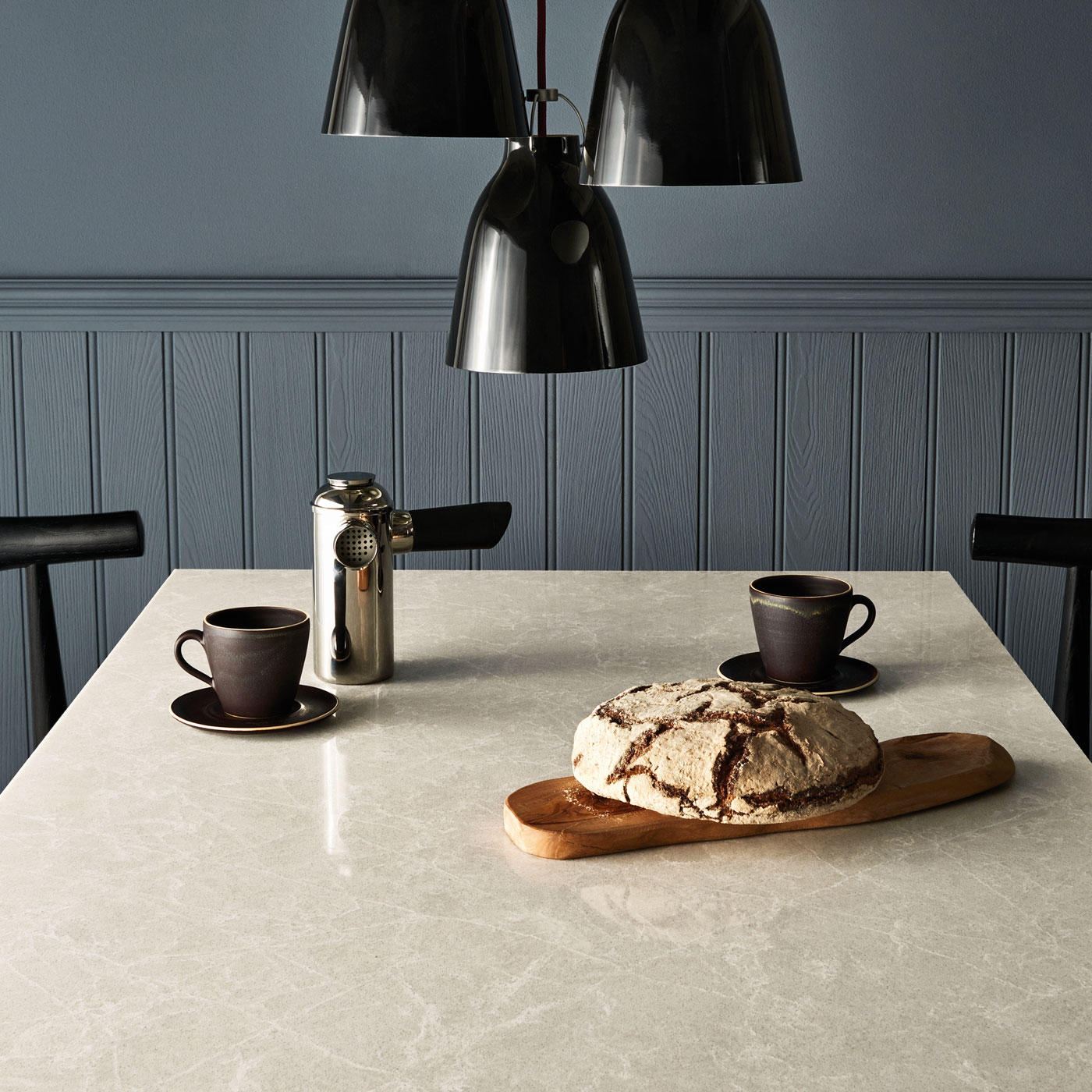
Cosmopolitan White / Caesarstone
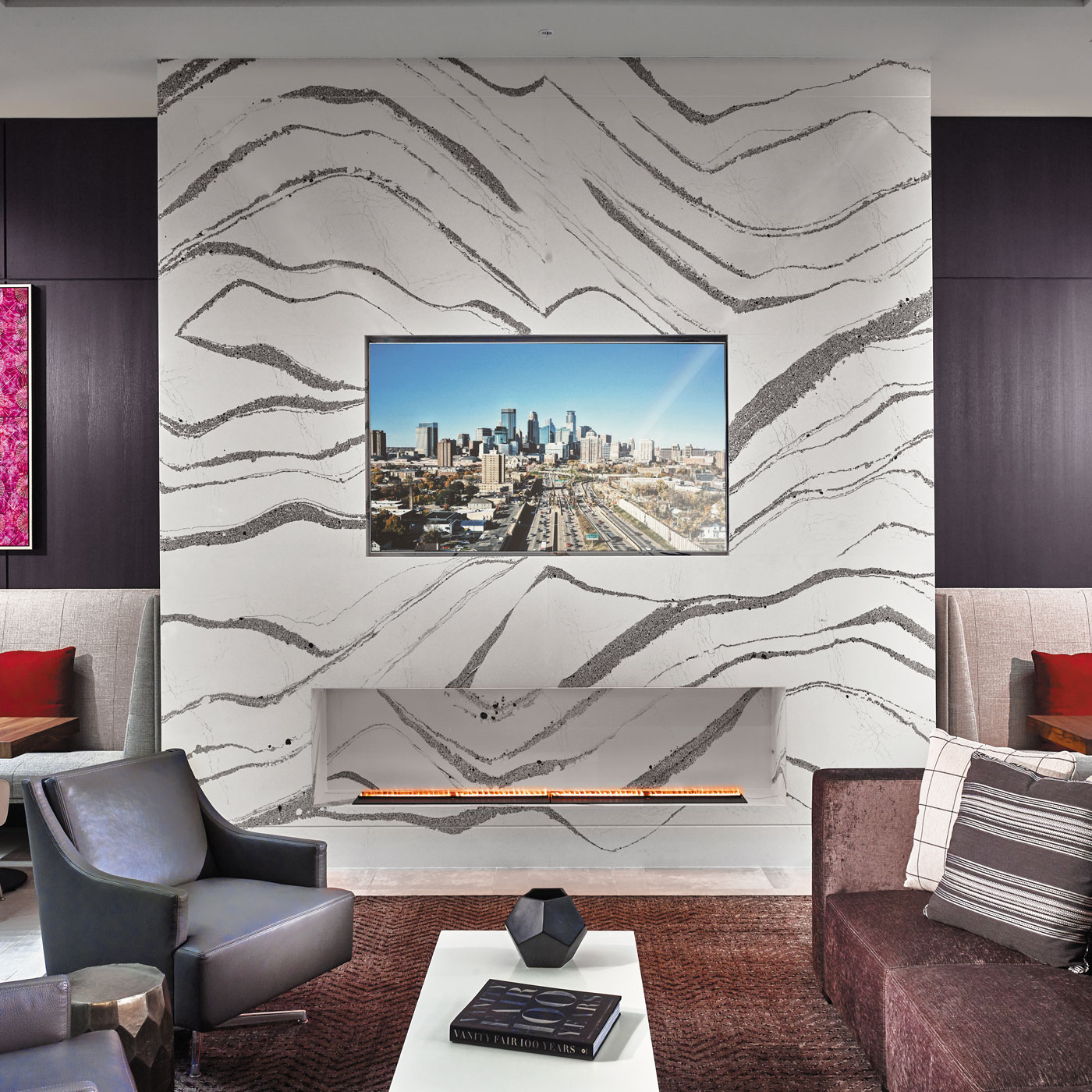
Annicca™ / Cambria
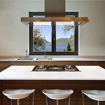
Everest White / LOTTE
“It’s essential that we be able to consistently make the innovative designs over and over again.”
Summer Kath
Cambria
And, while some people may see white as monochromatic, the reality is white means different things to different people. Elizabeth Margles, vice president of marketing for North America for Charlotte, N.C.-based Caesarstone, estimates there are more than 100 different shades of white. “There are certainly cool whites, warm whites, yellow whites, blue whites,” she observes. “It’s really such a neutral that anybody looking for any kind of color tone, working in any kind of light, to support wood cabinetry or stainless-steel appliances or terracotta floors, can find the right white to work for them.” Marco Scapin, art director for German-made Quartzforms®, agrees with Margles that part of white’s appeal is today’s trend toward white in kitchens, as well as the fact that the kitchen is a domestic environment dominated by sociability that requires a prevalence of light. However, some of it is also economic. “Surfaces such as a kitchen or vanity or flooring are long-lasting products in which the investment is reflected for a long period,” Scapin says. “The consumer tends to choose simple and safe colors, and white is often the predominant choice.”

Unearthed Coast / HanStone
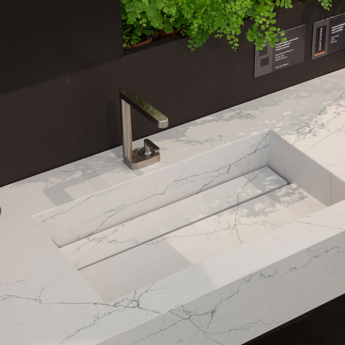
Planet Neptune / Quartzforms

White Attica / Caesarstone
A BIG STAR
So, which white is it that people want, and how large a role does the color play in the bottom lines of quartz-surface manufacturers? The role it plays is huge, although it varies by manufacturer. While Margles views an assortment holistically and says, “the whites leading into the grays are still a predominant basis of our business,” others are more-specific. Speaking of the U.S. market for Quartzforms, Scapin says over the last three years the white-light marble-look represents 50% - 55% of the company’s business, and Hyundai L&C’s Talbot says eight of that company’s top-10 sellers are in the white realm. LOTTE’s Humphries is even more-specific. “SKU- (stock-keeping units) wise, 24 of our 53 colors are white or a variation of it,” Humphries says. “They generate more than 80% of our sales, both commercially and residentially.” She adds that follows closely with what a client who builds multi-family residential projects in the Southeast and Texas recently told her. He said 80% of his business is white, 10% is gray, and the remaining 10% is split evenly between black and beige.

“24 of our 53 colors are white or a variation of it. They generate more than 80% of our sales.”
Allyson Humphries
LOTTE

Portrush™ / Cambria

Planet Mercury / Quartzforms
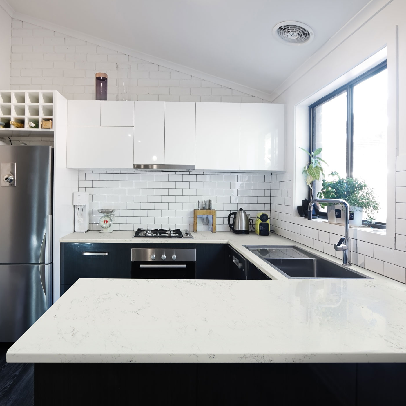
Lucern / LOTTE
As for how that breaks down between solid colors and those that show more of a marble look, Humphries says her observation is the solid colors are pointed more toward the commercial/multi-family residential projects because of price. For Quartzforms, there’s plenty of demand for both, according to Scapin. “The new technologies to produce Calacatta- and Carrara-look veined slabs have increased the demand for these products,” he says. “However, the market share of pure white and colors with light shades and hues is quite outstanding.” Caesarstone’s Margles says in some projects, that company is even seeing a mix of the solid colors and the veined ones. “We’ve been encouraging people to mix and match,” she says. “We’re talking about using it for a vertical surface, not just a horizontal one, and we’re encouraging people to maybe use one color to make a statement in their island, for example, and then coordinate a color on their other countertops or backsplash. We’re seeing people mixing the use of the solids with the veined look.” Although veining is prominent in many whites, it’s not the only method for introducing color that goes beyond a simple white. For instance, LOTTE’s Humphries notes its Radianz Alluring pattern includes veining and flecks of both gold and brass. “That’s designed to subtly highlight the brass fixtures that are really popular right now,” she says. Other manufacturers are offering designs that could never be quarried. Cambria’s Kath cites that company’s new Portrush™ design, for example. “That one is a beautiful navy blue and gold that’s quite unique,” Kath says. “You can’t find it in nature, but it still has an organic look and feel.”

“The consumer tends to choose simple and safe colors, and white is often the predominant choice.”
Marco Scapin
Quartzforms

“We’re in a constant state of product and color innovation."
Elizabeth Margles
Caesarstone
COLOR EVOLUTION
Keeping up with trends and making sure each company has an on-going supply of white designs – and designs in general -- can be a challenge, say all involved. Bringing a new color to market can be time-consuming. Depending on the company, the average time in development seems to be about a year, although it may vary depending on the manufacturer and design. “We’re in a constant state of product and color innovation,” says Caesarstone’s Margles. “It’s a 365-day process. I may be looking at color samples today that we’ll launch maybe in eight months, but maybe in 15 months of more, depending on the complexity.” Cambria’s Kath says fluidity is necessary, with a lot depending on finding a time when that company feels it’s appropriate to add new colors. However, something that’s truly amazing can go out the door fairly quickly. “It’s great when we’re innovating and coming up with new, never-seen-before designs, but it’s essential that we be able to consistently make the innovative designs over and over again,” Kath says. “We must deliver on our promise to our clients.” As for what influences those designs, a big part of it is fashion which can, in turn, influence new looks in other product markets. For instance, Quartzforms’ Scapin says it normally takes today’s hot looks three-to-five-years to hit the furniture industry. However, furniture is only one of several different markets that these companies typically follow. Others include paint and flooring. “We also look at the plumbing industry and the appliance industry,” says Kath. “Those are large companies that do a lot of research and they’re constantly coming out with new finishes. We also look at what’s on-trend for cabinets. We all need to live together.” Perhaps not surprisingly, LOTTE’s Humphries says that the company also keeps an eye on what’s happening with the natural-stone industry. “Natural stone changes subtly over time,” she observes. “Today, quartzites are becoming more popular, so with some of our man-made materials, we’re looking to emulate some of those looks. We’re trying to emulate what’s popular in the natural environment.” Still, it’s unlikely those various shades and hues of white, with and without veining, will be replaced by anything distinctly different anytime soon. Hyundai L&C’s Talbot, the former interior designer, says the market does seem to be moving away from the all-white peace-kitchen towards what he calls the “calm” palette. “We’re starting to see people moving toward kitchens with more wood integrated into the look, and quartz is moving toward that palette, as well,” he says. “We’re seeing it integrate more warm tones to reinforce the wood tones.” That should mean some people moving more toward darker shades, including the grays and matte blacks. However, Caesarstone’s Margles says there will always be a place for whites, if only because they’re so neutral. “There are some people who are willing to take more chances with their countertops than others,” she says. “Take our Vivid White, for example. If it’s surrounded by high-lacquer black cabinetry and an intense pattern tile floor, it’s not basic by any stretch. It’s still in the mix.”
K. Schipper
K. Schipper is a seasoned business-to-business (B2B) writer, including current work with Concrete Decor,Turf and RV Pro magazines. She's written about the dimensional-surfaces industry since 2003, and served as managing editor of Architectural Surfaces and Design (AS&LD) magazine.
